Showing posts with label Research. Show all posts

20 Aug 2012

Reflective Journal


In analyzing the study of the MA course, I think that different projects that I did compelled me to find inspiration from a great deal of sources by researching on successful artists and design and seeing lots of exhibitions in London, subsequently building on my imaginative capacity as well as my practical knowledge.  Therefore I feel I have gained and developed many skills in terms of my own personal creativity and development, and meanwhile I gradually found my own style in terms of composition and construction of communication.

At the beginning of the MA course I thought in the coming one year I will focus on the innovative forms of graphic design. In other word, I will try to breaks through the traditional expression of graphic design.  The design is boundless.  All accessible things are visual arts. So, the application of elements will not be limited to two-dimensional expression. It will reach the design of products, clothes or space.  What’s more, I will focus on the integration of art and design.  The final presentation of a work will not be limited to the printing technology or the expression of two-dimensional medium. It will be combined with more forms of art expression such as drawing, collage, devices and spatial hand painting. It will give people strong visual compact and shock to heart. The graphics is not just in two-dimensional space. The multi-dimensional application of visual elements could express actively and effectively the concepts of the works.

Now, the final show is coming, I think my final work follows my original thinking.  At the term one and two of the course, I was confronted with many challenges and hardship about understanding the difference between the questioning aspects of art and the communicating and problem-solving aspects of design.  But at last, thanks to some tutorials with Sigune and Silke, I tried to combine these different aspects in my final work ‘Brutality’. I was really pushed to think conceptually and found this project challenging, enjoyable and, most importantly, a significant step in furthering my creativity.  It not only questions the value of products and communicates with viewers by the form of ‘sale’ from the first day of the final show 10% off to the last day 100% off, but solves the problem of how to reuse discarded things as well by the medium of blue oil.  Thus, I think my final work achieves the integration of visual art and design, but it still needs to be examined by the viewers when they see my work in the final show.

3 Aug 2012

Written Paper


Written Paper
Jingfei Wang
MA Visual Arts (Graphic Design)
Camberwell College of Arts
August 2012

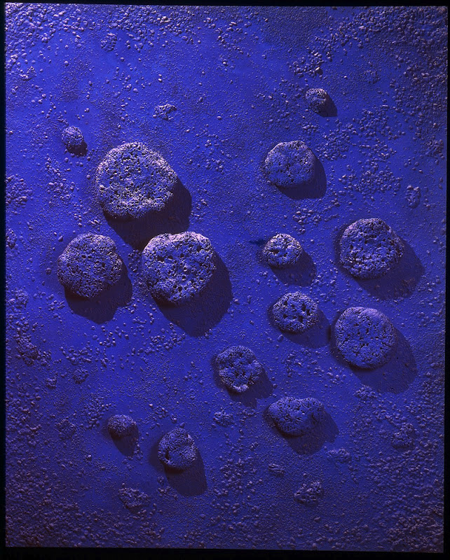
After doing the photography project, currently, I want to use the color of blue to be my personal symbol.  In other words, the blue oil color is like my personal logo.  Then I did my recent and final project, about ‘the value of discarded things’. This project tries to evolve, surprise and question the audience and the art world in this commercial society. To a large extent this project is about examining concepts of “value” in our culture and re-investing discarded, old, vintage things with meaning and use.   I’m trying to point viewers’ attention to specific objects and events in life that risk being overlooked as being too quotidian or too common.  I also think art making is less about the invention or construction of new things, but more about the close paying attention to existing things.  The abandoned things made by any human beings have witnessed the pass of time.  Giving these wasted old things a new life is a kind of return, as well as a kind of expectation to the nice time of the future.

In the final show I will set up a shop named ‘Brutality’ to sale these ‘redesigned products’ and randomly price them with very high price.  On the other hand, the shop will sell these things from 10% OFF to 100% OFF during the 9-day of final show in order to show the life-cycle of the product or the artwork.  And meanwhile, it will make viewers think about that what is the real value of packaged products and how do we value things.

After I finish the postgraduate course, I will return to China. As the cities are being reconstructed and newly built continuously in China, there will be a crying need for high-quality talents of art design, especially the designers with both the Chinese and Western ideas about design. The advanced design ideas and methods that I learnt in Camberwell College of Arts will definitely strengthen my competitiveness in the near future. I will engage myself in the field of design based on my expertise and make contribution to my motherland.  But as a new designer, I need several steps to achieve my ideal.

Commercialization of Art and Design
In China, understanding how to commercialize the idea of design by translating the idea to money is the first step to be a successful designer.  Because only solve the subsistence problem then can we achieve the ideal.

Brand Management of Commercial Design
Most of the primary designers when they graduate from the university just blindly access the design task without long-time aim and methods, which cannot truly improve the design ability of themselves.  Some of my friends try to change their occupation after doing the design several years.  They think, on one hand, they always do the similar design repeatedly and tediously that means there is no trace of achievement at all, on the other hand, there is no study room for improvement.  So I think it is very important that forming our own brand of design from the style of design to the long-time planning of development by picking out our own customers who are suitable to our style and making the feedback of our brand image to customers, and then achieving the expansion of the channel of customers.  Through which, more and more costumers will come to us and it will change the passive situation of the new designer.

Marketization of Brand
This step is according to the market demand to transform and progress the design. Thoroughly understanding the design intent of the market is beneficial for designers to break into the real market and improve the market influence of design.  Both the small design studio and big design company all rely on the brand market-oriented to survive.

Product Oriented Marketing
Product oriented first emerges in the field of industry and generally used in the utility industry, but in this day and age more and more ideologically oriented industries, such as the industry of design and Internet intend to adopt it.  In order to make the effectiveness of the amount of production, they use the reasonable production line planning based on the way of reproducibility and improvement and upgrading, which means making the design mass production.  Most artists and designers cannot understand it, because art and design is to create something unique and not replicable, and there is no so-called design pattern of mass production.  But too many resources have been developed and used in the present society, not excepting art and design.  Due to the refinement of the division of labor and job duplication, mass production is very necessary.  But the prerequisite is the effectiveness of the innovation.  If one idea of design can evolve more design creativity and make it through the product that can be accepted and used by people, then it will bring about huge income and obviously it will make designer mainly focus on mining the creativity and help them out of the repeated and tedious design.

Emotional Design
Actually, it is not a step of longer-term goal, it is the most important thinking of design, understanding the fundamental needs of the public, finding the breaking point of user emotion and making different surprise for the audience, and eventually letting them to psychologically dependent on the product.  Only through it, can impress people.  Making the perfect integration of design and emotion can not only bring about the sense of joy of design, but change the whole world by the advantage of design in a long run as well.

25 Jul 2012

Invisible: Art about the Unseen, 1957-2012 at HAYWARD GALLERY

Invisible Art brings together works from the past half century that explore ideas related to the invisible and the hidden. The exhibition includes work by some of the most important artists of our time as well as younger artists who have expanded on their legacy.


Many of the works in Invisible seek to direct our attention towards the unwritten rules and conventions that shape our understanding of art. Other works invoke invisibility to underscore the limits of our perceptual capacities or to emphasize the role of our imagination in responding to works of art. Some use invisibility as a metaphor that relates to the suppression of information or the political disappearance and marginalization of social groups.

 I have just discovered the work by Song Dong that I really like.. it captures such an something so personal and intimate and yet so ephemeral. Reminds me a lot of the work of Andy Goldsworthy and yet rooted in a totally different tradition.

Below is a text about this piece of work from the Webiste of the Asia Pacific Triennial of Contemporary Art:

Writing diary with water 1995–present comprises four photographs that document an ongoing performance project.

Since 1995, Song Dong has used a calligraphy brush to write daily diary entries in water on a particular block of stone. When Song Dong was a child, his father encouraged him to practise his calligraphy in water on stone because they could not afford ink and paper. As an adult, he returned to this practice when he realised that conventional diary writing posed a risk of disclosure:
‘You might not think about this generally but during the diary writing process consider that someone else might be reading this someday. Since considering this I stopped writing a traditional diary’. (1)

Through this invisible journal, Song Dong engages in the process of diary keeping, knowing that his diary will never be read and that his thoughts will remain secret. The water diary has now become an important part of his life and art:
‘After a while this stone slowly became a part of me. That means I could say anything to it and be unscrupulous. This act became a part of life and it made me more relaxed.’ (2)


10 Jul 2012

Yves Klein

"The imagination is the vehicle of sensibility. Transported by the imagination, we attain life, life itself, which is absolute art."


Yves Klein was the most influential, prominent, and controversial French artist to emerge in the 1950s. He is remembered above all for his use of a single color, the rich shade of ultramarine that he made his own, "International Klein Blue." But the success of his sadly short-lived career lay in attacking many of the ideas that underpinned the abstract painting that had been dominant in France since the end of the Second World War. For some critics he is a descendent of Marcel Duchamp, a prankster who lampooned settled understandings of painting and opened art up to new media. Others consider him as a descendant of earlier avant-garde artists such as Kazimir Malevichand Aleksander Rodchenko, who were also attracted to the monochrome. And even in the ways he used performance later on in his career, he is like many artists in the 1950s and 1960s who rediscovered some of the tactics of earlier avant-gardes. Klein might also be compared to his contemporary Joseph Beuys, for, like Beuys, he embraced aspects of Romanticism and mysticism - Klein was intrigued by Eastern religion and Rosicrucianism, and was even influenced by judo. Also like Beuys, many have condemned him as an obscurantist and a charlatan, yet the brevity, wit, and seductive beauty of much of his work continues to inspire.


The abstract painting that dominated French art in the 1950s was invariably premised on the notion that an artist could communicate with the viewer through the power of abstract form. But skeptics of modern, abstract art have always alleged that the viewers, like the faithful devotees of a false god, do more of the work than the artist, investing the forms with their own feelings rather than discovering the artist's. Viewed in this light, Klein's monochrome blue paintings might be read as a satire on abstract art, for not only do the pictures carry no motif, but Klein insisted there was nothing there at all, only "the void."


Klein's pictures may also be read in a contradictory fashion. He was genuinely fascinated by mystical ideas, by notions of the infinite, the undefinable, the absolute, and his use of a single rich and suggestive tone of blue might be seen as an attempt to free the viewer from all imposed ideas and let her mind soar. For, as Klein believed, lines in pictures were a form of "prison grating," and only color offered the path to freedom.


Throughout Klein's work, from his canvas monochromes to his later performances, there is a stress on immediate experience that reflects aspects of the Performance art movement of the 1960s. Although he was never specifically opposed to creating art objects, many of Klein's later works seem to want to abandon the object as a vehicle for art and instead find ways to more directly transmit ideas and experiences.


2 Jul 2012

Christine Hill


Christine Hill
An initial discussion, of course in a coffee shop, began with consternation that words like "revolutionary" and "genius" get thrown around, and have long become divorced from what they actually used to mean. They've become cheapened. Everyone's "genius" if they do something vaguely well, and every technical gadget is a "revolution". In our day to day exchanges, we are repeatedly getting sold something that isn't remotely what it pretends to be. Are we more satisfied with the packaging than the content? This extends farther beyond the concept of "revolution", to almost every cultural, ideological issue. We remember that subversive thought, along with the concept of the "underground", used to be something of extreme value. Today, if you don't have a mainstreamed blog that you can sell into a book deal within a one year turn around from launch, your vision risks being pronounced a failure.The name "Revolution Fleamarket" alludes to the fact that we have to still - we want to still - rummage for the real items of substance. We can't just get handed them on a plate, or in a 10-best-of list.The start of this collection was to see, in a limited space of time, how much revolution one can intentionally acquire. And what it looks like. We tried to buy the revolution. This is what we got.


10 Jun 2012

SIR JOHN SOANE'S MUSEUM

ABSOLUTELY AMAZING MUSEUM!!
It's my second time to the SIR JOHN SOANE'S MUSEUM, it still impressed me deeply!
Soane designed this house to live in, but also as a setting for his antiquities and his works of art. After the death of his wife (1815), he lived here alone, constantly adding to and rearranging his collections. Having been deeply disappointed by the conduct of his two sons, one of whom survived him, he determined to establish the house as a museum to which ‘amateurs and students’ should have access.


7 Jun 2012

Juan Muñoz:An Inaccessible Moment at FRITH STREET GALLERY

He described himself as a storyteller, and often arranged his figures and objects in carefully staged configurations that hint at unsettling and ambiguous scenarios. The way that the viewer encounters a work of art was important to Muñoz. He was fascinated by the tension between the illusory and the real, using tricks of scale and perspective to choreograph the viewer’s experience.


17 May 2012

Catlin Art Prize 2012 at LONDONEWCASTLE PROJECT SPACE

I'm really into the work of Poppy Bisdee, who graduated from Wimbledon College of art.
Working with various recording and presentation technologies such as film and projection, Poppy Bisdee creates minimal sculptures and installations which reflect space and time, and emphasise the physical, sensory and temporal experience of the work. The viewer is a central element, and by mirroring their physicality through images, sounds and shadows, Bisdee brings into question their role as spectator, subject or performer.

Bisdee’s works are often a response to the space where they are to ultimately be experienced by the viewer, generating various site-specific works in both the white cube spaces, and spaces charged with a history. By emphasising the sensory quality of materials in her work, Bisdee aims to heighten the viewer’s awareness of their perceptive senses. Inspired by Eadweard Muybridge’s pioneering use of photography to capture movement and time, Bisdee uses lengths of film in a similar vein, reflecting the viewer’s movement in a length of time. This has led on to explorations using a length of film to direct the duration of the act of viewing.


Fascinated by light, space and time, Bisdee explores ways of capturing and depicting these minimal and ephemeral elements that make up an experience. For example, in 12.11.10 a space was photographed at one moment in time. This photograph is then projected back into the space; and, this held moment presented through the transience of light, is framed by the constantly advancing time of the present space.


6 May 2012

Hans-Peter Feldmann at SERPENTINE GALLERY


It's not particularly common that Conceptual Art is thought-provoking, aesthetically pleasing and utterly desirable. Much less often does it engage a viewer with a cheeky sense of humour. The fact that the work of Hans-Peter Feldmann covers all of these points makes him a great asset to contemporary visual art.

Like many of his contemporaries (names including Joseph Beuys and Gerhard Richter), Feldmann came to international prominence in the 1970s; his pre-occupation is in the collection, categorisation, organisation and presentation of common, everyday objects. Systematic and thorough re-organisation of photographs of (generally assumed to be) the banal detritus of daily visual culture displayed across booklets, magazines, books, postcards and installation developed Feldmann's continued interest in slowing time down; using the visual tools of the daily grind, chronicled in the most expansive manner.

Feldmann might be seen as a kind of conceptual structuralist whose primary mode could be described as “this is not that.” It’s a strategy heavily reliant on seriality and repetition. If a viewer chooses to imbue a particular image or work with extra meaning, that seems fine with Feldmann.

To some extent, I think Feldmann uses different ways to intrude the original artwork and thus changing the original meaning, which likes my recent photography project but with different medium.